ANALYSIS. STRATEGY. RESEARCH. DESIGN. INTERFACE DESIGN. ANALYTICS.

The Problem
The Results

The old slot booking
The Process
I dedicated my time to understanding and defining problems, which meant a series of in-depth design thinking sessions in collaboration with the client was organized. I came home with a deeper understanding of the challenges as well as a suitcase full of colored Post-it notes!
I gathered all customer issues that were escalated to the Customer Services. I also gathered the Analytics information from the current website and created personas using this information.

The new slot booking


Empathize with the users
(Learning more about the audience)
A storyboard helps visualize the users’ actions and also the environment where they take place. While mostly used for empathizing with the users, storyboards can also be used in the idea phase to help illustrate some of the design choices.
_p.png)
Information architecture
Several versions of information architecture iterated throughout the design process. What may seem like a bunch of boring diagrams is the key to a pain-free design process.

Competitor analysis

Gather ideas, draw sketches evaluate sketches and redrawing

Giving early-stage prototypes that people can hold in their hands revealed a few significant issues with the booking delivery process. People were filling their carts only to discover that their order could not be delivered, or there were no pickup slots available. Summary: Allowed users to reserve delivery slots before they start shopping; clearly communicate delivery minimums and fees and allow users to specify substitutions for low-stock items as they shop.


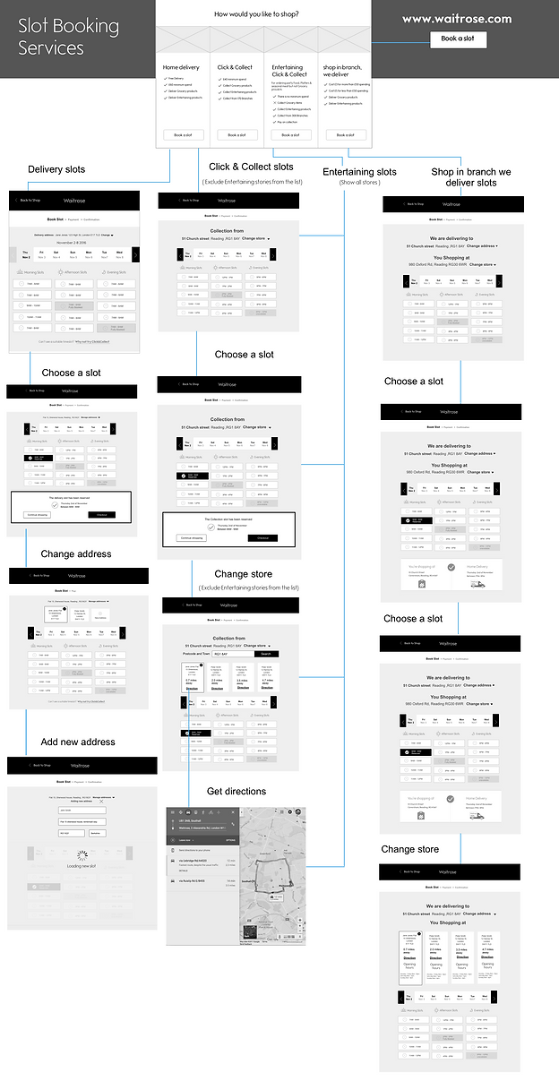
User journey maps - user flows

Usability testing

Validate
I validated my designs by testing 10 users with my working prototype. The 10 users were asked to walk through how they would book a delivery slot. All of the users were able to complete the tasks without any pain-points.
Important questions to consider: is the new “one day view” concept easy to read ? is it practical enough for the users to efficiently go ahead and choose their slots delivery options?
When users select their slots does it clearly show the slot that has been booked?
Tasks (up to 35 mins in total) Asking the participant to book a slot to deliver their shopping. Was it easy for the users to find the delivery slot that they want?
Asking the participant to change a slot that is already book. Do users know how to change the slot?
Asking the participant to book a slot a week in advance in case of a future event. Do users know how to select a future week?
Are the users confident that the slot has been booked? (i.e. is the confirmation message visible/clear). Do the users understand what is meant by “Fully booked” vs. “Unavailable”?


What participants said

I have found that no one had any issues booking with the new concepts. The features of the new concepts are designed to be responsive and clearer, giving a straightforward view to allow customers to easily focus on slot targets and also load a few slots to help the performance and decrease the number of double bookings.
As an outcome of the first test, I am confident that the overall concept was well received. Although some participants preferred the old design and didn’t engage with the new concept straight away, the overall feedback was positive. The session highlighted some areas of the UI, which weren’t intuitive, especially for color-blind users, allowing us to focus on the most critical areas that required improvement. Measuring usability with a scoring system
Measuring usability with a scoring system


Key findings from user testing session
To be taken concerning the “Unavailable/and Fully booked slots”: most users have not noticed or figured out the difference between those two elements.
“Free delivery messages”: some users did not understand that the delivery was actually free of charge.
Some users read the slot vertically, while others read it horizontally. We must work out a clear and precise layout.
More testing for “Color-blindness”.
2 hours to check if it is clearly not obvious enough.
“Click and collect” option has the same issue. This needs to be more obvious for the customer.

A significantly more-refined version of the design went into the preproduction build. I kept fine-tuning the experience with the real data connected to the backend.

